9.5 KiB
title: rainbow quox date: 2024-11-17 tags: [computer, website, fursona] summary: q.t. colour scheme generator ...
so how about that regular posting, huh. ha ha ha
i haven't been up to much unusual. drawing, mostly. i installed nixos on both my computers and it's going pretty well so far [(less than a week)]{.note}, but every computer toucher does that at some point, so, whatever.
anyway, to the point.
:::banner [go here if you just want to play with the thing][thing]
:::
the point
the animal-inclined might know that q.t. can change its colour any time it wants. if you click that link you can clearly see i have some tendencies, but it can in theory be anything. so something i have wanted for a while is a page where you can click a button and get a bespoke randomly-generated quox theme of your very own.
so i did that.
:::aside you can also skip to what i actually ended up doing, if you don't care about the false starts. :::
doing that
 {.floating .expandable .nobg .shaped}
pretty much what i want to do, at least to begin with, is take the original colours of the image and move the hues around at random.
if you look at mdn, you might see this interesting hue-rotate() thing that might do what i want. let's have a look.
Note:
hue-rotate()is specified as a matrix operation on the RGB color. It does not actually convert the color to the HSL model, which is a non-linear operation. Therefore, it may not preserve the saturation or lightness of the original color, especially for saturated colors.
well that doesn't sound very promising. but maybe it'll be fine, so let's try it. first, separate the pictures from q.t.'s refsheet into bits. like this.
 {.expandable .lightbg}
now let's layer them back on top of each other with some css.
<!doctype html>
<style>
#container {
  width: 100%; position: relative;
  img { position: absolute; inset: 0; }
}
</style>

<div id=container>
  <img src=outer.png>   <img src=belly.png>   <img src=eyes.png>
  <img src=tongues.png> <img src=collars.png> <img src=masks.png>
  <img src=socks.png>   <img src=stripes.png> <img src=lines.png>
</div>
 {.floating .left .nobg .expandable .shaped}
ok, next, actually try to do the hue stuff. to check it works at all, i shoved everything to hue 0° (using krita's hue HSL blend mode), and used hue-rotate() to change it back to the 'main' colour of each region---it won't look exact, but it'll be close.
#container img { filter: hue-rotate(var(--hue)); }

#outer   { --hue: 273deg; }   #belly { --hue: 26deg; }
#eyes    { --hue: 133deg; }   #masks { --hue: 284deg; }
#stripes { --hue: 188deg; }   #lines { --hue: 273deg; }
/* also add the id to each image */
right?
 {.expandable .nobg}
well that's no good at all. i guess that warning was serious.
ok what about blend modes
 {.floating .expandable}
all right, fine. what else. as a chronic over-user of overlay, i can certainly tell you that css has a few blending modes. not as many as krita, which has approximately "too many", but enough for most purposes. one of them is hue. how about that.
this takes a bit more messing, because i need to create a flood fill of one of the colours from that layer, and blend with that. so how about an SVG filter, i guess. or, six SVG filters---one for each filter, since you can't parametrise them.
time to copy and paste the same five lines six times. yaaaaaaaaay
 {.bigemoji .pixel} \
<svg style="position: absolute">
  <filter id="fouter">
    <feFlood result="hue" flood-color="#57267e" />
    <feBlend in="hue" in2="SourceGraphic" mode="hue" result="res" />
    <!-- ↓ without this the background will also be filled in -->
    <feComposite in="res" in2="SourceGraphic" operator="in" />
  </filter>
  <!-- …and same for the others, with different flood-colors -->
</svg>
#outer { filter: url(#fouter); }
/* …etc… */
and…
 {.expandable .nobg}
i was expecting at least the same thing, but a different, also wrong, result is pretty cool.
drastic measures
ok, enough messing around, time to bite the bullet. separate every single colour into its own layer, and use those as masks for colour fills.
now the pieces look like this:
 {.expandable .lightbg}
the colours in the images no longer matters, only the alpha channel. [(except for the eyes.)]{.note} each one is just a mask over a background fill of the right colour.
@layer {
  #container { position: relative; width: 90vw; aspect-ratio: 3439/2240; }
  #container div { position: absolute; inset: 0; mask-size: contain; }
}

@layer {
  #static { background: url(front/static.png) 0 0 / contain; }
  #eye-shine {
    background: url(front/eyes.png) 0 0 / contain;
    mix-blend-mode: luminosity;
  }
  /* the others all look like this: */
  #spines {
    background: oklch(30.77% 0.1306 var(--hue)); --hue: 298.19;
    mask-image: url(front/spines.png);
  }
  /* etc… */
}
<div id=container>
  <!-- divs not images now. the images are all in the background properties -->
  <div class=part id=static></div>
  <div class=part id=spines></div>
  <div class=part id=stripes></div>
  <!-- etc… -->
  <div id=eye-shine></div>
</div>
since the hue is separated out into a variable, i can just do:
for (const elem of document.getElementsByClassName('part')) {
  elem.style.setProperty('--hue', Math.random() * 360);
}
and instantly i have something working. i used oklch because it was more likely than hsl or whatever to keep the colours the same kind of distance from each other, since that is what it's designed for.
 {.expandable .hasborder}
keeping the colours in sync
so as of last year, most browsers got a thing called relative colours. if you have an existing colour --hi, you can rotate its hue by half a turn by saying something like
:root {
  --hi: #ea9aa1;
  --wow: oklch(from var(--hi) l c calc(h + 180));
}
header-includes: |
...
you're taking the value of var(--hi), keeping the lightness and chroma channels the same, and adding 180° to the hue.
:::aside
that's not quite true. safari, as always, does it slightly wrong. according to the spec, all channels in a relative colour must be dimensionless, but in safari, the hue is an <angle>. other browsers, following the spec correctly, don't allow that. so you actually have to write
:root {
  --hi: #ea9aa1;
  --wow: oklch(from var(--hi) l c calc(h + 180));
}
@supports (color: oklch(from red l c 10deg)) {
  :root { --wow: oklch(from var(--hi) l c calc(h + 180deg)); }
}
thanks apple! :::
so based on that, i can pick one initial colour and base all the others on it. like
:root {
  /* these aren't attempting to be the same colours, just guessing something
     that MIGHT look nice */
  --outer: #57267e;
  --spines: oklch(from var(--outer) calc(l * .75) calc(c * 1.25) h);
  --vitiligo1: oklch(from var(--outer) calc(1 - (1 - l)/4) calc(c / 2) h);

  /* static l/c values because the socks are always some pale colour */
  --stripes: oklch(from var(--outer) .9 12.5% calc(h + 120));
  --cuffs: oklch(from var(--stripes) .8 25% h);
  /* etc */
}

.outer { background: var(--outer); mask-image: url(front/outer.png); }
/* etc */
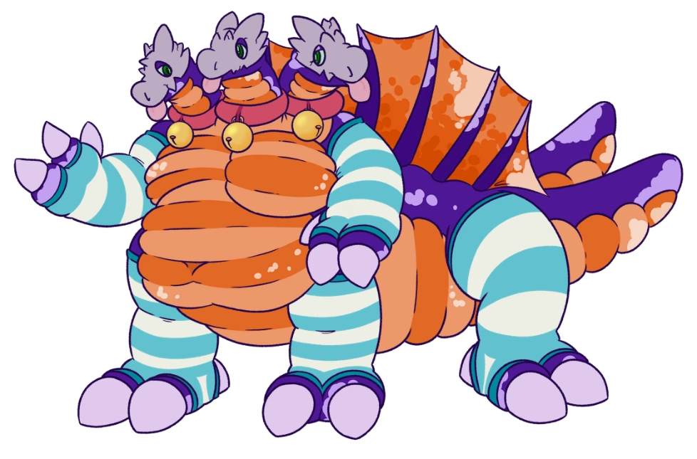
so after guessing a bunch of relative colours, i ended up with this:
 {.expandable .nobg}
notes for niss. if this goes online i fucked up
- palette types
- randomise distance between analogous colours
- light, dark, light-dark, dark-light (belly vs outer)
- reinstate chaos mode
- can you set the random seed in the browser
- no. anyway the algorithm might be different
- make yr own
- or https://stackoverflow.com/a/47593315. whatever
- if so: use that to make palette permalinks